Monday, January 12, 2009

Mist

Once in a while we get misty conditions. While it's fine to have a stroll in it and take pictures, you need to be at some height or distance to really appreciate the density - how it envelopes through the landscape and isolates the scenery in a most unique way.


Misty Trees


Misty Ridgetown


Sinking In The Mist

 
Misty Port Credit


Misty Lighthouse

Saturday, January 10, 2009

More Abstracts

I've got some catching up to do, but that leaves me with more to post inevitably!

Some days I'm not sure if I'm completely lost, uninspired or have misguided attempts at aesthetics. It must all be in the seer.
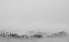
 
Untitled

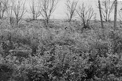
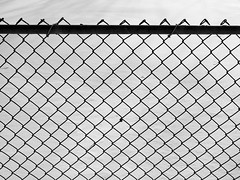
I got a couple comments on the above. One person in particular seemed to thoroughly enjoy it which makes me think deeply about what its draw is. I believe unconscious feelings exist in photography or can reflect who the person is. Often you only realize these things about your photographs after receiving feedback from others. The fence against the freshly fallen snow appears vast and daunting - as if looking through a window after waking up, but our eyes haven't adjusted and cannot continue to look; to see what's past that window.
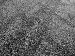

Treads

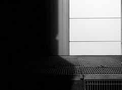
A simple, but strong pattern of tire treads. Both arcing slightly and intersecting one another. From the angle it was taken from, it implies movement away from the corners where they emerged. Having lines emerge from or flow toward the corner of a photograph gives the feeling that they continue to infinite.
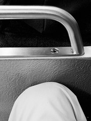
 
Waiting

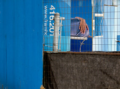
I like the view 50mm gives (an eye's perspective). My knee in white and highlight tones contrast with the dark hood of the passenger in front of me. The bar and seat give the viewer a bit of relief from the otherwise abstract feel.

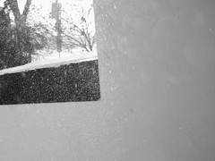
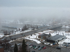
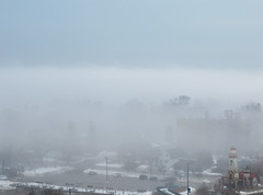
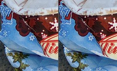
The draw for this would be the snow captured and its swirling motion. You can especially see its rousing activity in the black area and how much MORE there actually is when the sun hits it in this place versus the whites. It wasn't taken peering out a window like it could suggest and I won't bother saying how which isn't very exciting. I think if a photograph looks like something, it is that something.

Saturday, December 27, 2008

Toronto

I don't often take my camera downtown due to the inconvenience factor, but since I also work downtown some days I can fit it in. I was on an abstract roll in November and got a lot of enjoyment out of it. Heck, if I hadn't been doing something different that month I wouldn't have had a submission to Visual Arts Mississauga.

 
An Ad for all transit systems


Scene from a bus shelter


Platform #4

I suppose the appeal for the bus shelter shot is the wet and grit and it's also a half decent landscape shot. The "sky" at the back is actually a concrete barrier which suits the grey tonality of the rest of the photo very well. It's nice that it didn't blow out because it would have distracted from...the car! There's a car reflection - unintentional statement of some sorts?

Platform #4 I intentionally metered for whatever highlights could be preserved because it was far too dark for any other kind of photography. What's left is a sort of etch-a-sketch of the highlights flowing in from the end of the tunnel and the bush sheds (where the steam and exhaust escape).

The next photo of the tourist bus I thought was pretty effective because the painted design on the side of the building looked as if it was the front of the bus 10x optically zoomed. It matches well I think.

I'm not sure what words to describe the last with. I like geometry paired with INTERESTINGNESS. It is said black and white photos need definite 'black' and 'white' points as a general rule (helps with perceived contrast). What draws me to this photo is that the black and white points aren't purely for dynamic range, but act as a stark contrast between black and white. Oh...and the shadow...a mouth?

Friday, December 12, 2008

Cards

Each year, for the last 3 years, I've been buying nice boxed cards (multiples) from this cool stationary store in Bloor West Village. The point is, I don't use any one card all up, then the following year I have one more variety to pick from and send out. They're blank inside, small (not poster board size like the one's at Hallmark), and have some spiffy artwork. So it's especially a joy to get a new pack each year and maybe (hopefully) some friends will notice the little extra thought put in.

Plus dot dot dot...

I found a very heart warming quotation (even for me) on a card I disliked and wrote it down to use LoL

Thursday, December 11, 2008

VAM Juried Show

One night I was looking for other facilities similar to the Living Arts Centre. I came across Visual Arts Mississauga who are located inside Riverwood Garden Park in...duh...Mississauga. Lucky for me they were having their first Juried Photographic Show (this means something) and the deadline hadn't passed. To make a long story short, I initially entered two black & whites photos on my form, but they didn't turn out equally as stunning in print for reasons like 1) the one photo was too flawed for a print 2) contrast issues with both. Fortunately I'd been on an abstract bent in November and had one especially suitable photo to mate with the 'New Media' theme. This time I entered one colour photo. Costs to have a photo framed start at $100 or more if you're doing custom work plus the printing which isn't so bad because I set mine up using a 'bulk' option (cheaper).

The day I dropped it off I saw a lot of intimidating entries coming through the door. The next morning would have been "pick-up day" meaning epic failure to those who prepared their framed work already LOL. Yes, I am only laughing because I did get accepted and quite proud of it! 'Juried' means a panel selects which photos are in the exhibition. It gives you a little more credibility and is required for Canada Grants if I should apply. I was surprised at two things: 1) The couple of photos I did manage to see that came through the door WERE NOT in the show 2) How impressive the body of work at the show was. These judges were NOT giving away bonus points for youth or 'trying'...actually I could have been the youngest person there woo! After browsing around a little the price seemed to be comparable with the other photos - about $200-400. So great success this time around with the printing (learned a lot about matching media and the levels in your photo are critical if they're being printed) and framing I had time to get custom work done. I only hope now I can reimburse myself with a sale ;)


The rest can be seen at: http://www.flickr.com/photos/jehather/

Tuesday, December 2, 2008

Paper Folding

How many triangles can you find? :-O

Monday, December 1, 2008

Antique Light Filter and LAB Blurb

I've been using Lightroom to organize and export my files for a quick preview of what the result might look like. After choosing what I like, I can squeeze more quality out of them in Photoshop CS3 - like the LAB sharpening method. Unfortunately, if I like an effect in Lightroom, it's not so easy to replicate in Photoshop so this is just the export. 
I learned about the LAB method from a friend a while back. You should use it when editing 16-bit files. If you use it on 8-bit files, it has been mathematically calculated that you will lose more colour information from the resulting colour space changes (RGB --> LAB --> RGB) than the benefit is worth. LAB sharpening affects the lightness channel. Lightness is a representation of how the human eye perceives brightness through the colour spectrum. It won't increase edge contrast or introduce colour artifacts like typical USM.

More about it here and how to do it here.

The easy way to do it (do this after you resize):
1) Convert to LAB colour space
2) Select the "Lightness" channel only
3) Sharpen (I like Smart Sharpen w/ lens blur option and 10-20%)
4) Select "Lab" channel
5) Convert back to RGB colour space

Not sure why I'm linking a thumbnail size since you can't tell the difference, you'll have to click below to view the uncompressed PNG version:

 
Click and view 'all sizes'