Monday, January 12, 2009

Mist

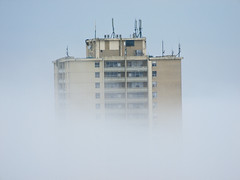
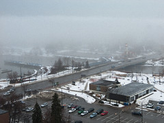
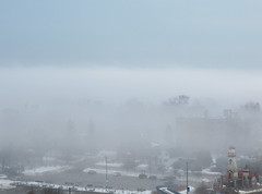
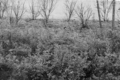
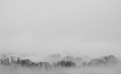
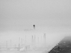
Once in a while we get misty conditions. While it's fine to have a stroll in it and take pictures, you need to be at some height or distance to really appreciate the density - how it envelopes through the landscape and isolates the scenery in a most unique way.


Misty Trees


Misty Ridgetown


Sinking In The Mist

 
Misty Port Credit


Misty Lighthouse

Saturday, January 10, 2009

More Abstracts

I've got some catching up to do, but that leaves me with more to post inevitably!

Some days I'm not sure if I'm completely lost, uninspired or have misguided attempts at aesthetics. It must all be in the seer.
 
Untitled

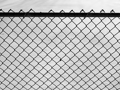
I got a couple comments on the above. One person in particular seemed to thoroughly enjoy it which makes me think deeply about what its draw is. I believe unconscious feelings exist in photography or can reflect who the person is. Often you only realize these things about your photographs after receiving feedback from others. The fence against the freshly fallen snow appears vast and daunting - as if looking through a window after waking up, but our eyes haven't adjusted and cannot continue to look; to see what's past that window.

Treads

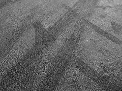
A simple, but strong pattern of tire treads. Both arcing slightly and intersecting one another. From the angle it was taken from, it implies movement away from the corners where they emerged. Having lines emerge from or flow toward the corner of a photograph gives the feeling that they continue to infinite.
 
Waiting

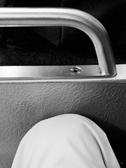
I like the view 50mm gives (an eye's perspective). My knee in white and highlight tones contrast with the dark hood of the passenger in front of me. The bar and seat give the viewer a bit of relief from the otherwise abstract feel.
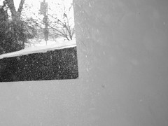
The draw for this would be the snow captured and its swirling motion. You can especially see its rousing activity in the black area and how much MORE there actually is when the sun hits it in this place versus the whites. It wasn't taken peering out a window like it could suggest and I won't bother saying how which isn't very exciting. I think if a photograph looks like something, it is that something.
Saturday, December 27, 2008

Toronto

I don't often take my camera downtown due to the inconvenience factor, but since I also work downtown some days I can fit it in. I was on an abstract roll in November and got a lot of enjoyment out of it. Heck, if I hadn't been doing something different that month I wouldn't have had a submission to Visual Arts Mississauga.

 
An Ad for all transit systems


Scene from a bus shelter


Platform #4

I suppose the appeal for the bus shelter shot is the wet and grit and it's also a half decent landscape shot. The "sky" at the back is actually a concrete barrier which suits the grey tonality of the rest of the photo very well. It's nice that it didn't blow out because it would have distracted from...the car! There's a car reflection - unintentional statement of some sorts?

Platform #4 I intentionally metered for whatever highlights could be preserved because it was far too dark for any other kind of photography. What's left is a sort of etch-a-sketch of the highlights flowing in from the end of the tunnel and the bush sheds (where the steam and exhaust escape).

The next photo of the tourist bus I thought was pretty effective because the painted design on the side of the building looked as if it was the front of the bus 10x optically zoomed. It matches well I think.

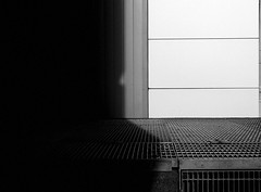
I'm not sure what words to describe the last with. I like geometry paired with INTERESTINGNESS. It is said black and white photos need definite 'black' and 'white' points as a general rule (helps with perceived contrast). What draws me to this photo is that the black and white points aren't purely for dynamic range, but act as a stark contrast between black and white. Oh...and the shadow...a mouth?

Friday, December 12, 2008

Cards

Each year, for the last 3 years, I've been buying nice boxed cards (multiples) from this cool stationary store in Bloor West Village. The point is, I don't use any one card all up, then the following year I have one more variety to pick from and send out. They're blank inside, small (not poster board size like the one's at Hallmark), and have some spiffy artwork. So it's especially a joy to get a new pack each year and maybe (hopefully) some friends will notice the little extra thought put in.

Plus dot dot dot...

I found a very heart warming quotation (even for me) on a card I disliked and wrote it down to use LoL

Thursday, December 11, 2008

VAM Juried Show

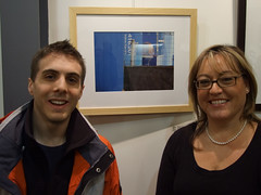
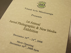
One night I was looking for other facilities similar to the Living Arts Centre. I came across Visual Arts Mississauga who are located inside Riverwood Garden Park in...duh...Mississauga. Lucky for me they were having their first Juried Photographic Show (this means something) and the deadline hadn't passed. To make a long story short, I initially entered two black & whites photos on my form, but they didn't turn out equally as stunning in print for reasons like 1) the one photo was too flawed for a print 2) contrast issues with both. Fortunately I'd been on an abstract bent in November and had one especially suitable photo to mate with the 'New Media' theme. This time I entered one colour photo. Costs to have a photo framed start at $100 or more if you're doing custom work plus the printing which isn't so bad because I set mine up using a 'bulk' option (cheaper).

The day I dropped it off I saw a lot of intimidating entries coming through the door. The next morning would have been "pick-up day" meaning epic failure to those who prepared their framed work already LOL. Yes, I am only laughing because I did get accepted and quite proud of it! 'Juried' means a panel selects which photos are in the exhibition. It gives you a little more credibility and is required for Canada Grants if I should apply. I was surprised at two things: 1) The couple of photos I did manage to see that came through the door WERE NOT in the show 2) How impressive the body of work at the show was. These judges were NOT giving away bonus points for youth or 'trying'...actually I could have been the youngest person there woo! After browsing around a little the price seemed to be comparable with the other photos - about $200-400. So great success this time around with the printing (learned a lot about matching media and the levels in your photo are critical if they're being printed) and framing I had time to get custom work done. I only hope now I can reimburse myself with a sale ;)


The rest can be seen at: http://www.flickr.com/photos/jehather/

Tuesday, December 2, 2008

Paper Folding

How many triangles can you find? :-O

Monday, December 1, 2008

Antique Light Filter and LAB Blurb

I've been using Lightroom to organize and export my files for a quick preview of what the result might look like. After choosing what I like, I can squeeze more quality out of them in Photoshop CS3 - like the LAB sharpening method. Unfortunately, if I like an effect in Lightroom, it's not so easy to replicate in Photoshop so this is just the export. 
I learned about the LAB method from a friend a while back. You should use it when editing 16-bit files. If you use it on 8-bit files, it has been mathematically calculated that you will lose more colour information from the resulting colour space changes (RGB --> LAB --> RGB) than the benefit is worth. LAB sharpening affects the lightness channel. Lightness is a representation of how the human eye perceives brightness through the colour spectrum. It won't increase edge contrast or introduce colour artifacts like typical USM.

More about it here and how to do it here.

The easy way to do it (do this after you resize):
1) Convert to LAB colour space
2) Select the "Lightness" channel only
3) Sharpen (I like Smart Sharpen w/ lens blur option and 10-20%)
4) Select "Lab" channel
5) Convert back to RGB colour space

Not sure why I'm linking a thumbnail size since you can't tell the difference, you'll have to click below to view the uncompressed PNG version:

 
Click and view 'all sizes'

Saturday, November 22, 2008

Snowfall

We had our first significant snowfall on Thursday, all day.
I started to recall exposing for snow scenes since I spent a significant amount of time reading on the topic last winter. In brief, cameras are calibrated to expose for photos assuming every object in the world reflects 18% of the light they receive regardless of TONE. While snow is white - a very, very, very, very light tone - it also reflects 36% of the light hitting it. This plays a trick on the camera: it detects twice the amount of light intensity and changes its exposure to obey the 18% rule; but what you end up with is a -1.0 stop (a halving of light) underexposure and 'grey' appearing snow. To fix this, in any snow covered scene: change your metering to Spot, point the camera at a patch of snow and either increase your EV (exposure compensation) by +1.0 stop or in Manual mode change your shutter speed so that the light meter indicator is about 3 steps towards highlights from the centre. If you don't have Spot metering, still point your camera at the snow and change your exposure as above. All the other tones in the scene will fall into place and snow will appear a nice BRIGHT crisp white!

Here's some first attempts for the season:


Monday, November 17, 2008

Escalator to Platform #3

Now with a title and I reshot it on a tripod.

Sunday, November 16, 2008

From The Train Station

Can't explain why I brought my camera with me out in the rain on Saturday, but I managed to get one very pleasing composition - aesthetically anyway...highly subjective!

I'm attracted to it so much so that I plan on retaking it. The shot used 1/6th shutter speed at ISO 200, not bad looking still, but lacking texture where there clearly is texture.

Sunday, November 9, 2008

Fall Colours (2 of 2)

Haven't taken anything new for what feels like a week now. These were the last and most noticeably intense colours still clinging on.
The third from the top is a vertical perspective of the green, red, and orange trees seen in the second photo.
The fourth is just around the corner from my building. The stark shadows must have been emitting from the church behind me. They add very strong contrasting shape - rectangular versus triangular - and line - where shadow and light meet. One other feature to mention can be seen where the shadows and fence meet. The outline is distinctly point...acute like a knife.

Wednesday, November 5, 2008

Fall Colours (1 of 2)

Late fall colours taken around Port Credit:


Besides obviously wanting to capture colour, other things attract my attention to them. I am drawn to the forms in the composition which appear as shapes or implied lines to me.
I took the last photo on an overcast day unsuccessfully and immediately wanted to retake it on the very conditions above. The shape of the tree lends to the shape of the ground - they both slightly rise in the same spot. The lake reflection suitably matches the sky and - you can only see this in the larger version (click!) - a small tree below the horizon to the right is teeming with fall yellows.
The first photo is around a favourite spot (in any light). I foremost wanted to capture the stark shadow, but needed to put more thought into making the photo about more than that shadow. I pointed the camera towards the setting sun in attempt to compose something and saw the lens flare (usually bad) creeping in. This time it didn't overly blow out the exposure of the photo and its placement lent to the diagonal line of the shadow - so I shot it!
Quick things to say about the second: 1) The tree stumps appear as dark silhouettes emerging from the lake behind them 2) the splash of yellow foliage in the centre is a nice, but not detracting focal point 3) the golden light seems to illuminate everything in just the right way to compliment the yellows 4) the line of the path ties the elements of the picture together and makes this rather mundane scene on any other day look special.
Quick things to say about the third: 1) The shape consists of the bushiness of the foliage, the parallel upright tree stumps, and the contrasting diagonal lines of the wooden planks below.

Friday, October 31, 2008

Fishes

The playground at Memorial Park was finally abandoned due to the cold weather and I'd always liked the designs on the 'safe' matting underneath the swings. I noticed afterwards I'd caught a leaf doing cartwheels in the wind!
The original colour photo certainly didn't put any emphasis on anything, so I modified it in black & white with some heavy handed use of the colour sliders in grayscale. The leaves took on a pastel appearance with some shading still visible to define them and a slight black halo to make them 'pop' from the rest of the photo.
The second photo is similar processing to have the leaves 'pop', but with a definite focus on the fishes swimming towards the frame's edge (or lawn).

Tuesday, October 28, 2008

Organization Of The Many

Another aspect of photography I'd love to improve on is seeing organization in the many. A lot of my flickr friends are good at this. I have a few examples, but literally just a few. When executed well the photo has a noticeable focal point, but one which does not overwhelm the rest of the frame - similar shapes or patterns still emerge. Some personal favourtes:


Black-Eyed Susans


Goldenrod

It's extremely satisfying to my eye when you can show the multiples - the variation within - while still maintaining balance in the composition. Plants commonly grow amongst the same vegetation - in showing the surroundings this way, it gives a good depiction of the whole rather than an isolated part.

More foliage shots to come as I can find them...

Saturday, October 25, 2008

Port Credit Village Times Contest

Not the winner and I do love the winning photo by the way. It feels great to be among some excellent pictures.

The photo: http://flickr.com/photos/jehather/2724340938/

Tuesday, October 21, 2008

Umbra

I attempted some high contrast black & white processing on my photos recently. I wanted to do something more abstract and forget the whole preserving tonality thing for a little while. By no means is black & white any representation of reality.


Umbra

Maybe this is a compass?
The high contrast appears to invert the darks and lights in an unusual way. We can see the blocked sunlight casts the shadow, but the result of it overwhelms almost two thirds of the frame suggesting it is the source of light. It mirrors the long shadows of late evening.

Saturday, October 18, 2008

No Weather Too Dark

Thursday was allegedly the best kind of weather for photography - overcast. Overcast light softly illuminates everything making it easier for exposure choices, dynamic range handling, and sometimes lends to more evocative black and white photos - with lesser contrast you can expose for more blacks and greys rather than lights.
By the time I set out that day it was 5:30P and dark overcast by then. I took the same route below, took my mind off the slow shutter speeds and tried for some eerie motion instead.

 
(1/4 second)

  
(0.9 second)

The only 'trick' I've read to producing cool photography implying movement is to make fluid motions with the camera. Say you're walking up a driveway - don't move the camera away from your body, keep it steady in one place and let your legs do the moving for it. One other thing to consider is how long your shutter speed will be. Too long and your photo may become washed out and overexposed; too short and that may not afford you enough time to record motion.
After that it was definitely too dark for most photography, I tried firing my flash to give some artificial highlights. What I understand is a typical flash will force your camera to use a fast shutter speed and Slow Syncro - which I used that evening - considers exposure for the whole scene while giving the subject in focus the 'fill' flash to even out illumination.


Here is what's looking to be more and more like it will hold a coffin, but it's nowhere near the other tombstones.

And my favourite, not setup in any way, a chestnut lying on a nearby bench. The out of focus are tombstones which nobody but me can tell unfortunately. What stood out for me is the softness of the light and how the chestnut stops your eye from following the diagonal line of the wood. There are enough blacks to balance it out in my opinion, though it could use the slightest bit more depth of field.